7 Essential Reasons Why Your Ecommerce Website Homepage Design Matters More Than You Think
Make your ecommerce website homepage design work harder for you. Learn how to optimize your online store homepage for user experience and conversions with actionable tips, design best practices, and must-have elements that turn visits into sales.
First impressions count, right? Especially online. Think about it: someone clicks onto your ecommerce website homepage. Boom. In seconds, they’re sizing you up. Do you look legit? Can they find what they need? Is it easy to use? That quick snapshot decides whether they stick around to buy or bail on your page. Your ecommerce website homepage design? It’s not just window dressing. It’s your secret weapon to turn browsers into buyers.
Picture a physical shop - you wouldn’t throw it together, would you? Your online storefront needs the same love and attention to pull people in, keep them hooked, and turn them into happy customers. According to Shopify’s research on ecommerce website designs, a well-designed homepage can significantly impact user engagement and sales.
Want to know why your ecommerce homepage design is so important and, most importantly, how to optimize your online store homepage for user experience and conversions? Let’s get into it. The Psychology Behind First Impressions Ever wonder why people judge a website so fast? It all boils down to a few key things happening in their brains: A. Visual Trust: How Design Influences User Trust and Credibility In the online world, trust is everything. People can’t touch your products or meet your team.
So, your ecommerce website homepage design needs to scream, “We’re legit!” A great-looking site instantly builds confidence. But a messy, amateurish design? It sends people running. Think about it: would you buy a fancy watch from a dingy store with bad lighting? Nope. Same rules apply online. Good visuals, a solid brand look, and a clean layout show you care. It proves you’ve invested in your business and want to give customers a great experience.
Research from Forbes shows that prioritizing user experience in your ecommerce website design directly impacts customer trust and conversion rates. B. Cognitive Load: Why Simplicity and Clarity Win Attention Cognitive load? That’s basically how much brainpower it takes to understand something. A confusing homepage cranks up cognitive load, making it hard for people to find what they want. And when folks get overwhelmed, they bounce.
That’s why simple is best when you design ecommerce website homepages. A clean, easy design lets people quickly see what you offer and find what they need. Use clear headlines, short descriptions, and plenty of white space to make things easy on the eyes. Don’t throw everything at them at once; guide them through with smart design choices. C. Emotional Resonance: How Homepage Visuals and Copy Trigger Feelings That Lead to Action It’s not all about logic.
Emotions play a HUGE part in buying decisions. Your homepage should spark the right feelings, ones that match your brand and your products. This means choosing visuals, writing copy, and creating an overall vibe that clicks with your target audience. Selling eco-friendly stuff? Use natural colors, nature pics, and words about sustainability. Got a luxury brand? Think elegant fonts, high-quality photos, and a sophisticated feel.
The goal is to make people feel something when they land on your ecommerce website homepage design. Homepage Design and Its Direct Impact on Conversions Your homepage? Yeah, it’s a big deal. It’s often the first thing people see, and that first impression can make or break your conversion rates. If you want to optimize your online store homepage for user experience and conversions, pay special attention to these elements: A.
Above-the-Fold Real Estate “Above the fold” is what you see without scrolling. This prime real estate needs to grab attention and communicate your message fast. What needs to be front and center right away on your ecommerce website homepage design? •Your Value: What makes you special? Why should people buy from YOU? Tell them, quick and clear. •A Killer Headline: Make it catchy! Speak directly to what your target audience wants or needs. •A Call to Action (CTA): Tell people what to DO!
“Shop Now,” “Learn More,” “Sign Up”, make it obvious, eye-catching, and persuasive. •Stunning Visuals: Show off your products and your brand with amazing photos and videos. B. Navigation Clarity Imagine walking into a mega-store and having no clue where to even begin. Annoying, right? That’s how people feel with bad navigation. Clear, easy-to-use navigation is key to getting people where they want to go on your ecommerce website.
A good menu helps people browse categories, find specific items, and learn about your company (About Us, Contact, Shipping, etc.). The smoother the journey, the more engaged they’ll be, and the less likely they’ll bounce. Plain and simple: make it easy for customers to find something, or they’ll shop elsewhere.
According to Onilab’s eCommerce homepage UX best practices, intuitive navigation is one of the most critical factors in creating a good ecommerce website that converts visitors into customers. C. Mobile Responsiveness In today’s world, if your ecommerce website homepage design isn’t mobile-friendly, you’re missing out. Your homepage NEEDS to look and work great on phones, tablets, and everything in between. A bad mobile experience leads to frustration, high bounce rates, and lost sales.
Mobile responsiveness means your site automatically adjusts to fit the screen. Fonts, images, layouts, everything adapts. Buttons need to be easy to tap, and navigation needs to be touch-friendly. Make sure everyone has a great experience, no matter how they’re browsing. For more insights on creating a mobile-friendly online store, check out our guide on how to make a no-code online shop that works beautifully on all devices.
Key Metrics Affected by Poor Homepage Design A bad ecommerce website homepage design can mess with your bottom line in a lot of ways. • Bounce Rate: This is the percentage of people who leave your site after viewing only one page (usually the homepage). A high bounce rate means your homepage isn’t grabbing their attention or meeting their needs. • Session Duration: How long people spend on your site.
Short sessions mean people aren’t finding what they’re looking for, or your site just isn’t interesting enough. • Cart Abandonment Rate: The percentage of people who add stuff to their cart but don’t check out. Lots of things cause this, but a confusing or untrustworthy homepage can definitely be a factor. If they can’t find what they want or don’t trust your site, they won’t buy. •Conversion Rate: The percentage of visitors who complete a desired action, like making a purchase.
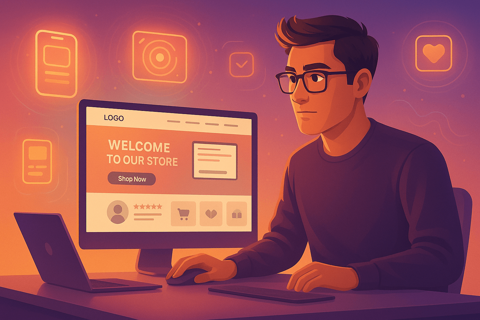
A low conversion rate means your ecommerce website homepage design isn’t doing its job of turning visitors into customers. Essential Elements of a High-Converting Ecommerce Homepage Want a homepage that actually converts? Make sure you include these elements to attract, engage, and persuade visitors when you design ecommerce website homepages: A. Hero Section with a Strong CTA This is the first thing people see. Make it count!
Use your best headline, a quick summary of what you offer, and a stunning visual (photo or video). Most importantly, include a clear CTA button: “Shop Now,” “Learn More,” “Get Started,” etc. Choose one that aligns with your goals. B. Featured Products or Categories Show people what they could be buying! Highlight your best-selling products with great photos and short descriptions. Consider using a product carousel or slider to show off a variety of items without overwhelming people.
Organize featured products by things like season or promotion. C. Social Proof (Reviews, Testimonials, Trust Badges) Build trust with social proof. Show off customer reviews and ratings. Display security badges from trusted payment processors to reassure visitors that your site is safe. D. Clear Navigation/Menu Make it easy for people to find stuff! Use clear, descriptive menu titles and organize them into logical categories. Keep the navigation consistent across your ecommerce website.
This is a fundamental aspect of creating a good ecommer